... and be sure to click over to You Have Been Here Sometime and read our short guest post about Ettore Sottsass, his Superbox, and all things boxy and striped.
 Sottsass's boxes from Italy: The New Domestic Landscape. MoMA's fantastic 1972 book of the exhibition which unleashed the juggernaut of the Italian radicals.
But If you're too lazy, here's our guest post:
I've asked some interior designers, writers, & artists to guest post on YHBHS this week. I simply could not be more excited that Wary Meyers are writing today's post!!!
Their perspective on interiors is like no other. Their gorgeous coffee table book "Tossed & Found" explains what to do with all your pool noodles and pastry bags, who knew?
And their blog has given me so much joy, that it's just ridiculous to talk further about. (take a look at their current installation if you don't believe me...) Thanks Wary Meyers, and Happy Valentine's day to all!
 Sottsass's boxes from Italy: The New Domestic Landscape. MoMA's fantastic 1972 book of the exhibition which unleashed the juggernaut of the Italian radicals.
WARY MEYERS' guest post.......
"Probably the first Ettore Sottsass' work I ever saw was something Memphis, which is all so mind-blowingly crazy that it's almost too difficult to process, at first. Of course after looking at it for a bit (or longer) eventually you wonder, "what mad genius thought of this??"
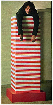
What I like about Sottsass is exactly that madcappery- designing with carefree optimism. A few years before the introduction of Memphis, he designed the SUPERBOX which is a wardrobe, and my favorite Sottsass. Hard-edged, candy-striped, and on a pedestal , it seems like a simple enough modern reworking of a free-standing wardrobe, but it's monolithic and fun, like a Donald Judd at the circus. Straightforward enough, but I'm fairly sure if Sottsass hadn't designed it, still to this day no one would have.
I've always been a fan of boxes as a design element, which probably stems from a youth of blocks, Lego, and D&D graph paper. The Superbox, in all its wardrobe forms, is the ultimate box - a beautiful graphic element made three-dimensional and useful.
Sottsass on top of his Superbox,
from a 1974 Oui magazine article on the new domestic landscape.
A mixture of Sottsass and Glaser for a more customized wardrobe idea, but actually sketched for a typography project we're working on right now.
photo and drawing via Wary Meyers
A random photo of a garage in Europe, the striped tool chest looking very Sottsassed, which I'm sure is unintentional and probably based more on kilometer blocks or European traffic graphics (if anything); but a testament to Sottsass's design that I look at this and think how awesome the tool chest is. But to put this all in an Italian design perspective I think the same way with Superstudio furniture and anything with grids.


No comments:
Post a Comment